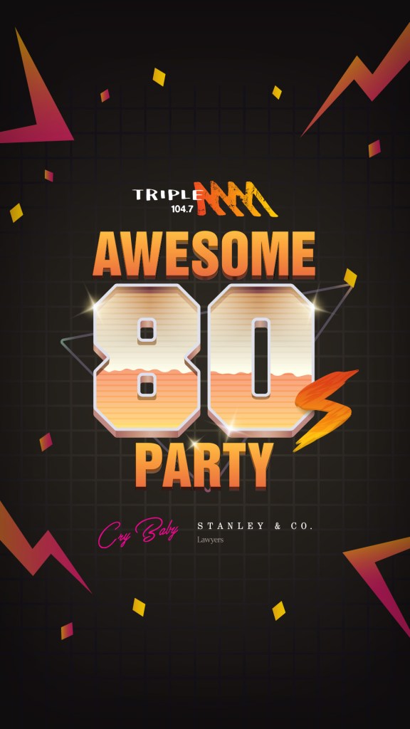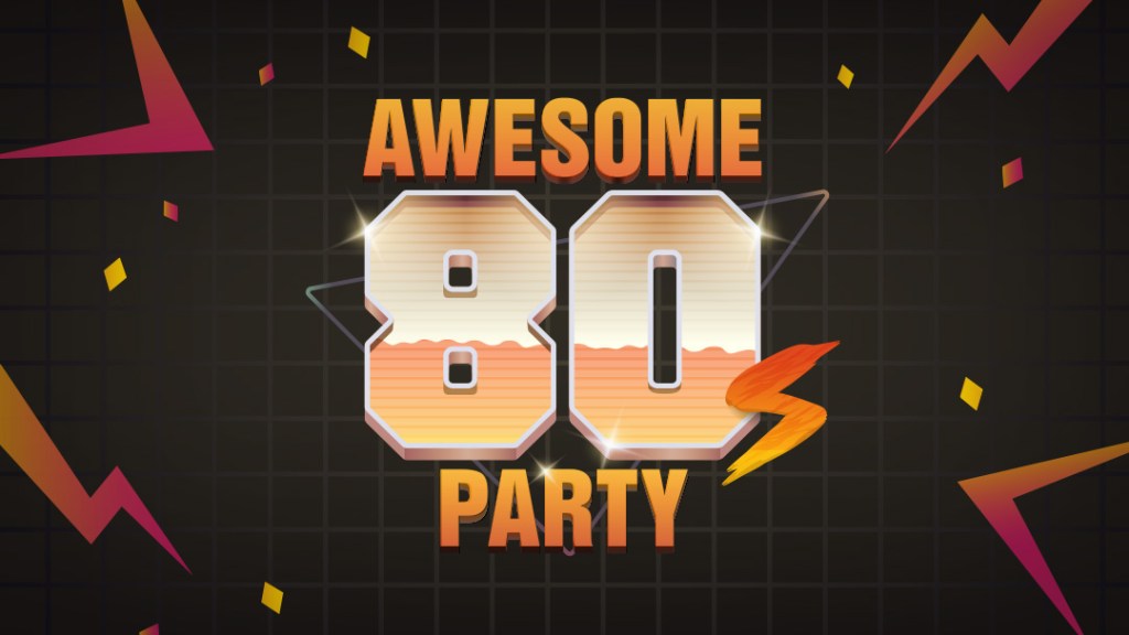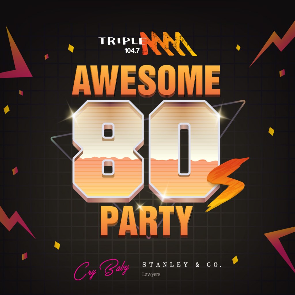
The Promotions team really wanted to emphasise into the 80’s imagery, so I designed a lockup that leant into the chrome/vapourware elements often seen accompanying designs that emulate the 80’s. I tweaked the colours away from the pinks & blues often seen with this type of imagery to keep true to the Triple M branding and colours.