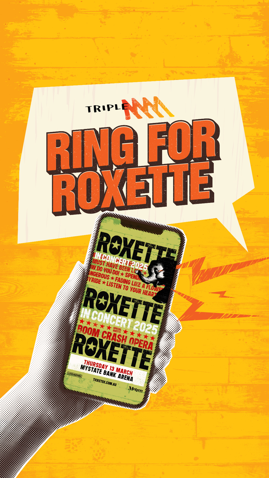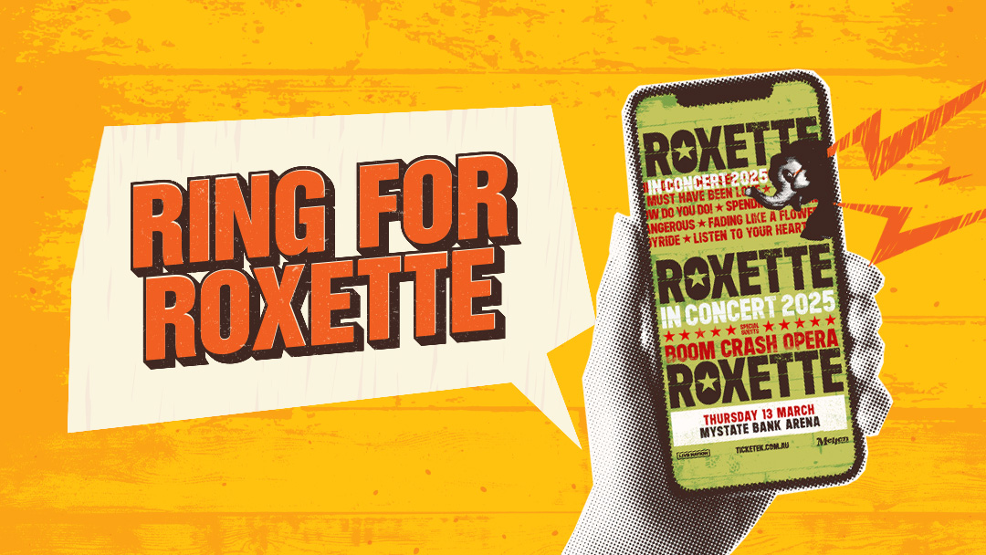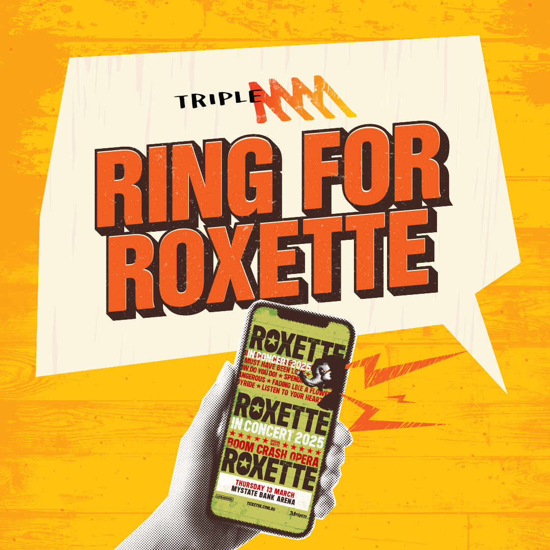
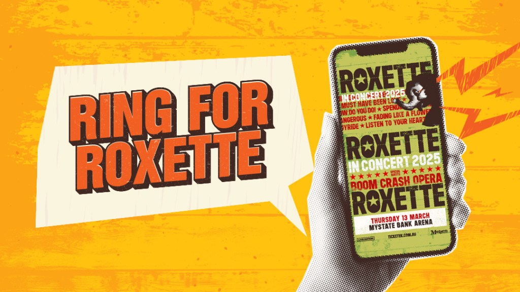
Often, when creating a design for a client-lead campaign or tactic, it’s smarter to integrate their supplied work into a design rather than integrate our branding into their design. This ensures the design will scale across a suite of images, and reduces back and forth for everyone. For this campaign, I took the supplied client poster and borrowed the branding from it, as it closely resembles the Triple M branding. I pushed the textures throughout the image to emphasise the grunginess of the brands, and I placed the poster on a smartphone to allude to the CTA.