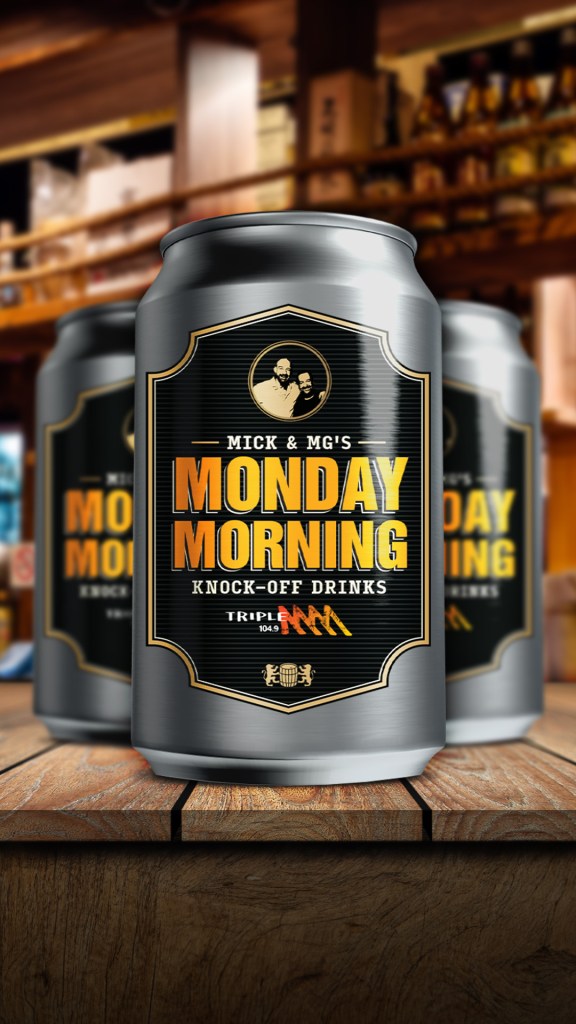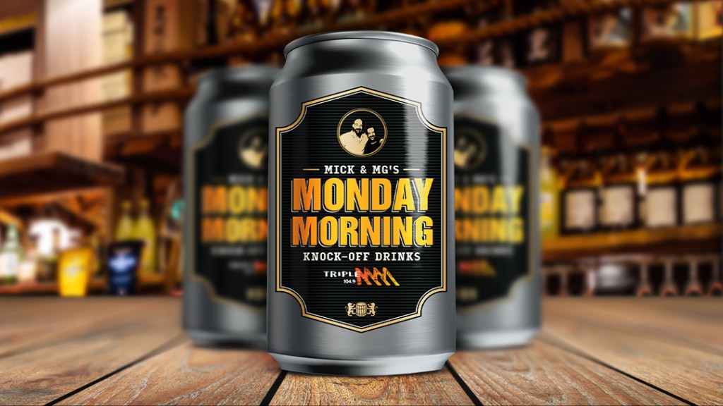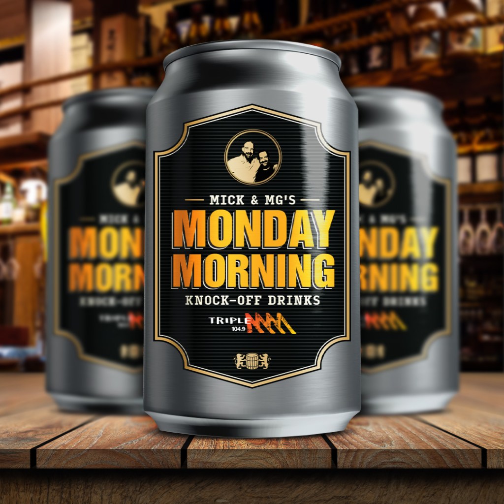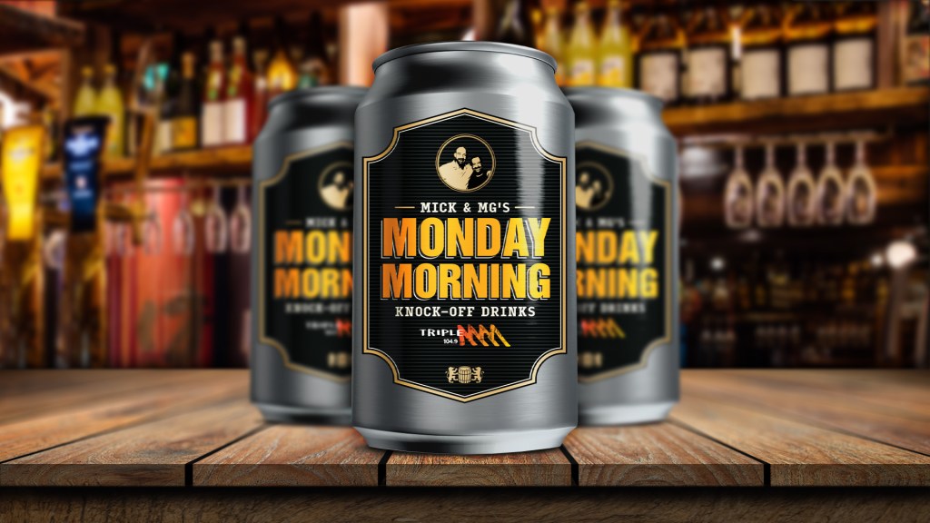
Initially, the campaign had a different name with a different design entirely.
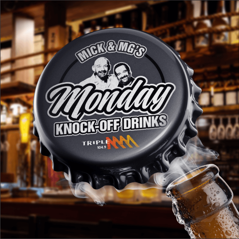
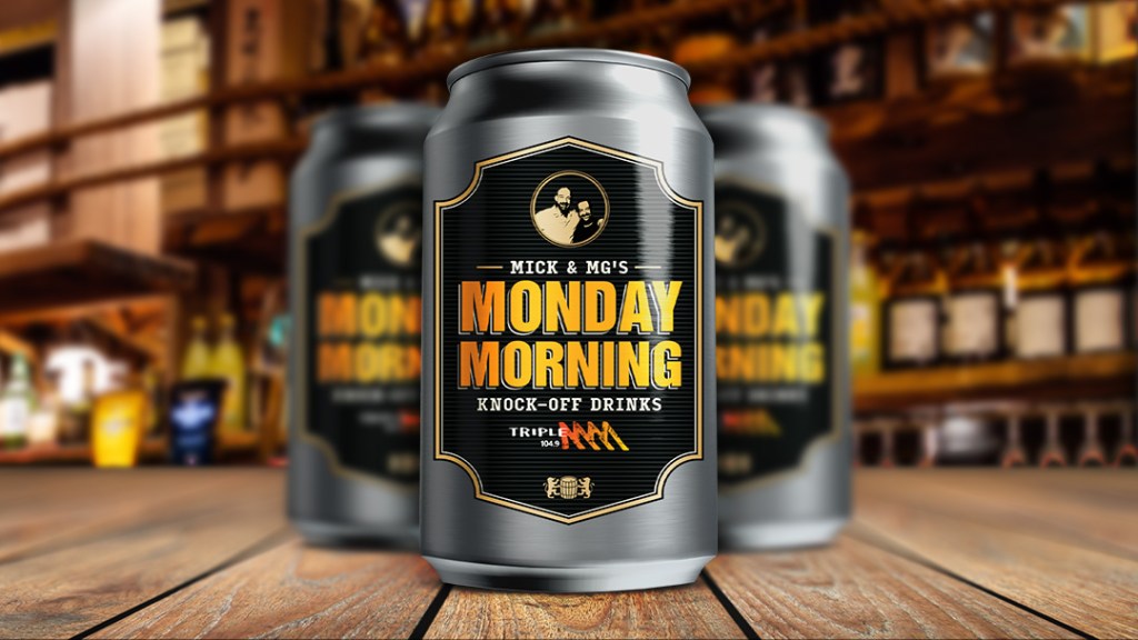
The client came back during a round of feedback and asked to change the name from “Monday Knock-Off Drinks” to “Monday Morning Knock-Off Drinks”. After some brainstorming and trying to get the design to work as-is, I decided to take a risk and redesign the lockup and main imagery from the ground up.
Starting with a strong lockup and label created in Illustrator, I then integrated the label onto beer cans that I placed onto a wooden surface. I added a touch of blur to create depth, and blend with the background in a more seamless way.