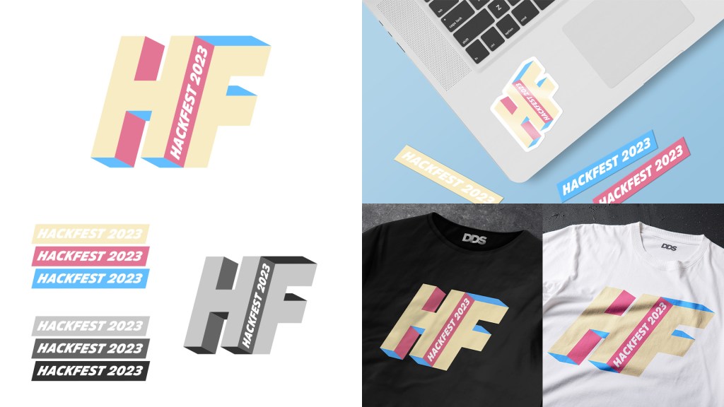
For the second Hackfest logo, I followed the idea of ‘a different perspective’ and ‘seeing things differently’, leading to this design reminiscent of a Penrose triangle or an impossible object. I really enjoyed pushing the forced perspective and making people think a little differently. I chose one of the strips for a smaller or wider logo to add more versatility to the logo group, and used colours to add depth and perspective. Again, I made shirt and sticker mockups to show what the design might look like physically.